
Layout
Big highlights
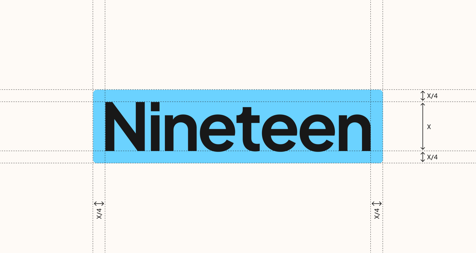
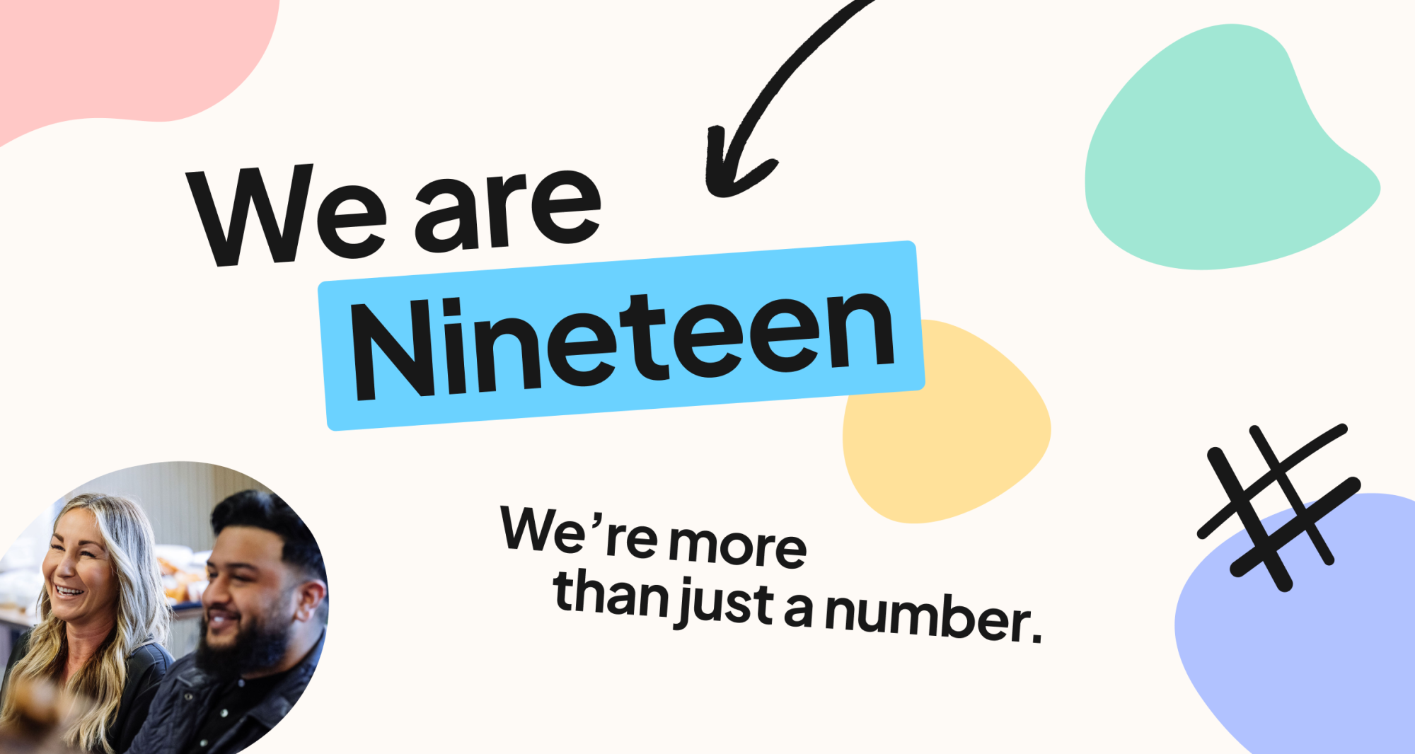
Large headlines, such as those used in website hero sections or on the front covers of presentation decks, can be highlighted using Nineteen Blue. The blue highlight should extend beyond the word by one quarter of its cap height (defined as X/4) on all sides, with cap height (X) referring to the vertical distance from the baseline to the top of flat uppercase letters.
Line height & indentation
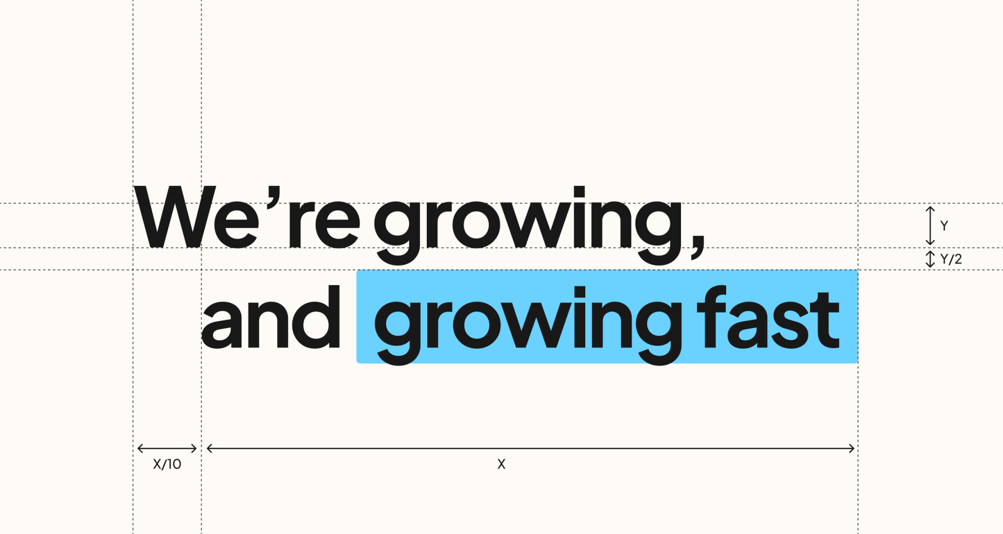
When using multi-line headlines, the second line can be indented by approximately 10% of the total text width (defined as X) to create a more dynamic composition. Line spacing should remain tight and consistent, with the space between lines set to half of the y-height (defined as Y/2), where y-height refers to the vertical distance from the baseline to the top of lowercase letters.
Highlight angle
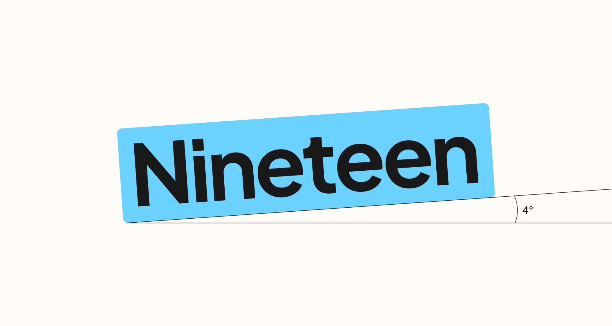
Text can also be displayed at an angle to create a more dynamic and expressive layout. An angle of 4° is recommended as the standard, though it can be applied in either direction (e.g. 4° or -4°). In applications where greater variety or emphasis is needed, the angle can be increased up to 8°.
Application example
Big highlights are used for large-format text applications, such as website hero sections and presentation deck cover pages.
Small highlights
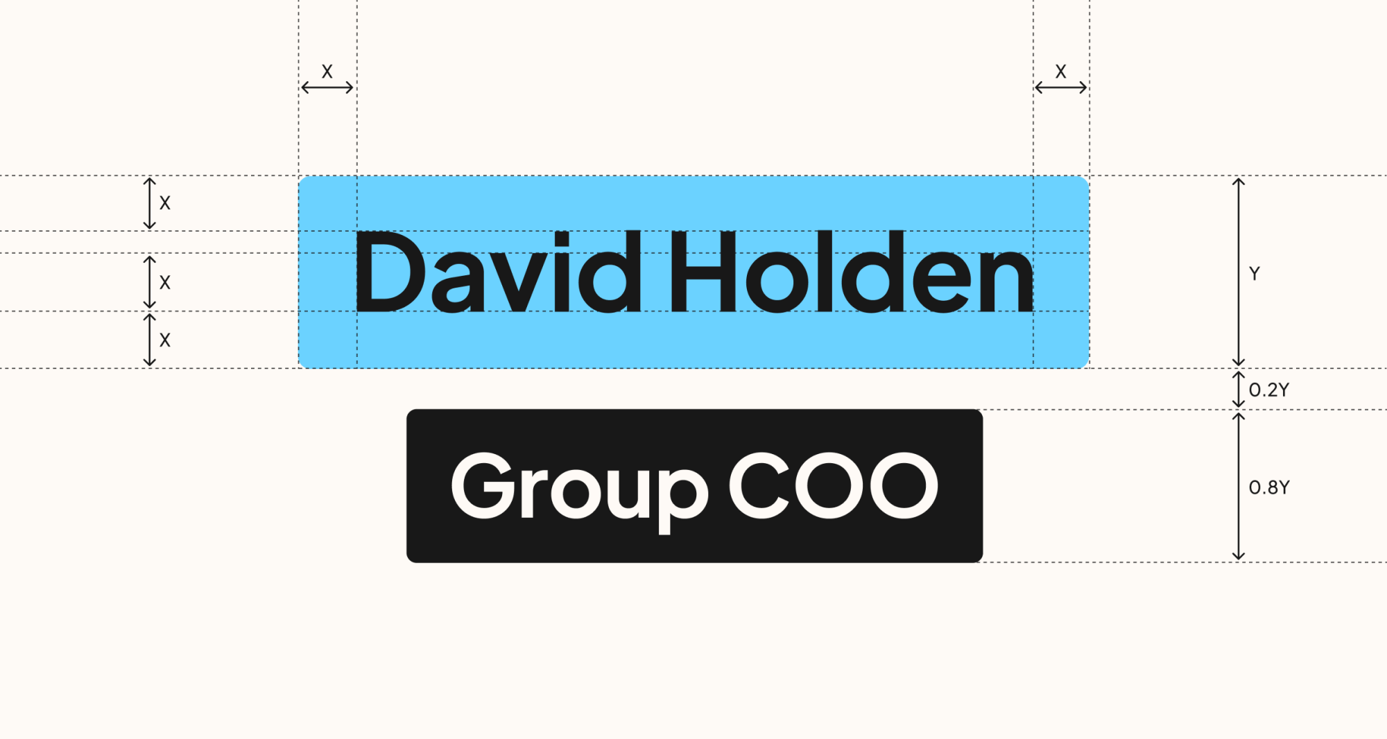
For smaller text, such as team names and job titles, the blue highlight uses more generous internal spacing than the headline treatment. The padding is based on the x-height, measured from the baseline to the top of lowercase letters.
Supporting text can also be displayed within a black highlight. The height and spacing are proportionally based on the height of the blue highlight (defined as Y).
Small highlights application examples
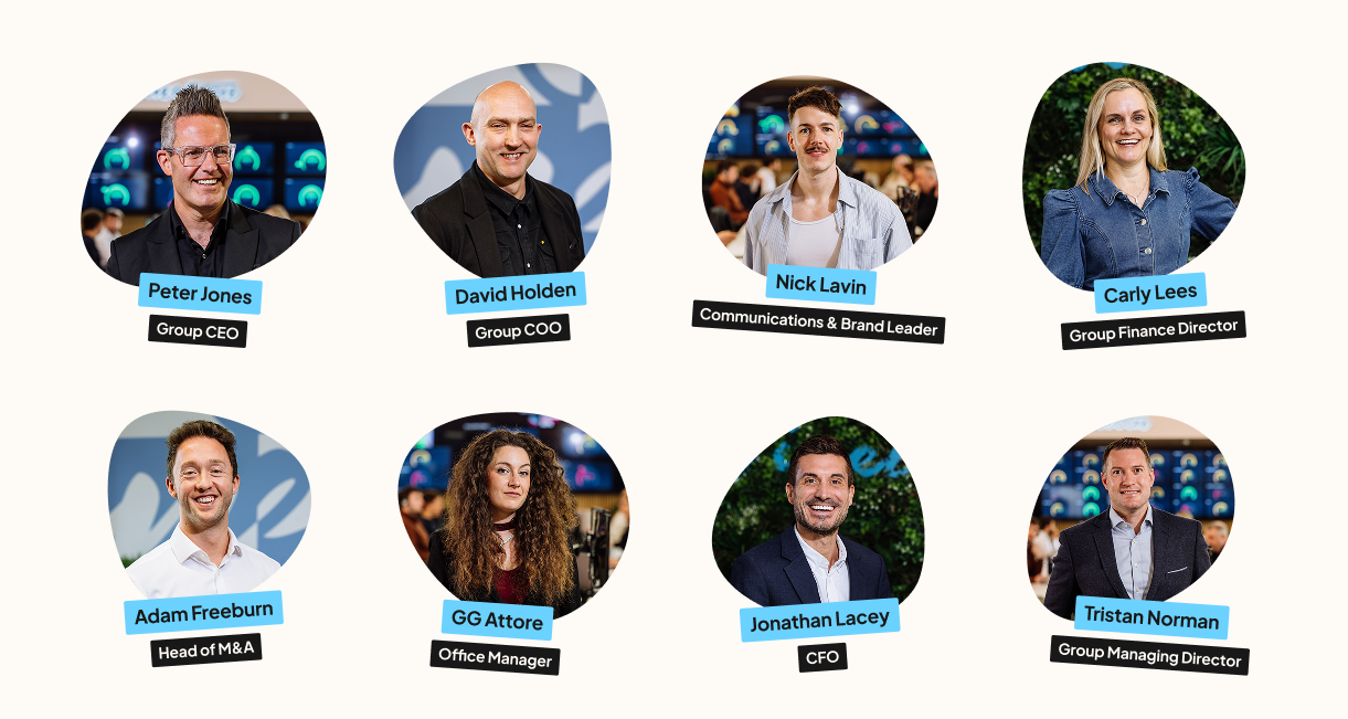
Smaller highlights are used for smaller text applications, such as names and job titles accompanying individual team photos on a website or presentation deck.
Containers
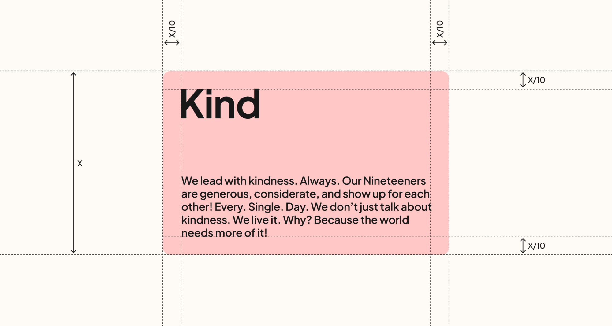
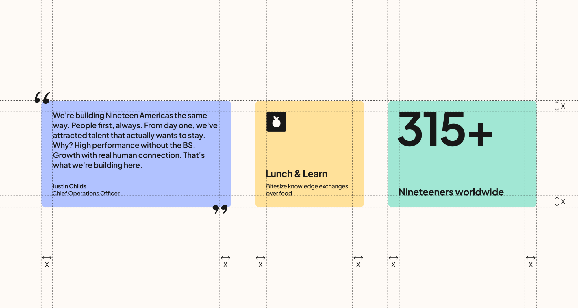
Containers help present content in a balanced and structured way. Internal spacing should use 10% of the container’s shortest side (X/10) as padding on all edges. Headlines align to the top of the safe area, while supporting body copy aligns to the bottom, creating a clear and balanced visual hierarchy.
Container applications
Containers can be used flexibly across the brand system — from testimonials and quotes, to icon-and-text layouts, and statistics. While content may vary, all containers should maintain a consistent sense of internal padding to create a balanced look (defined as X).
Container grid
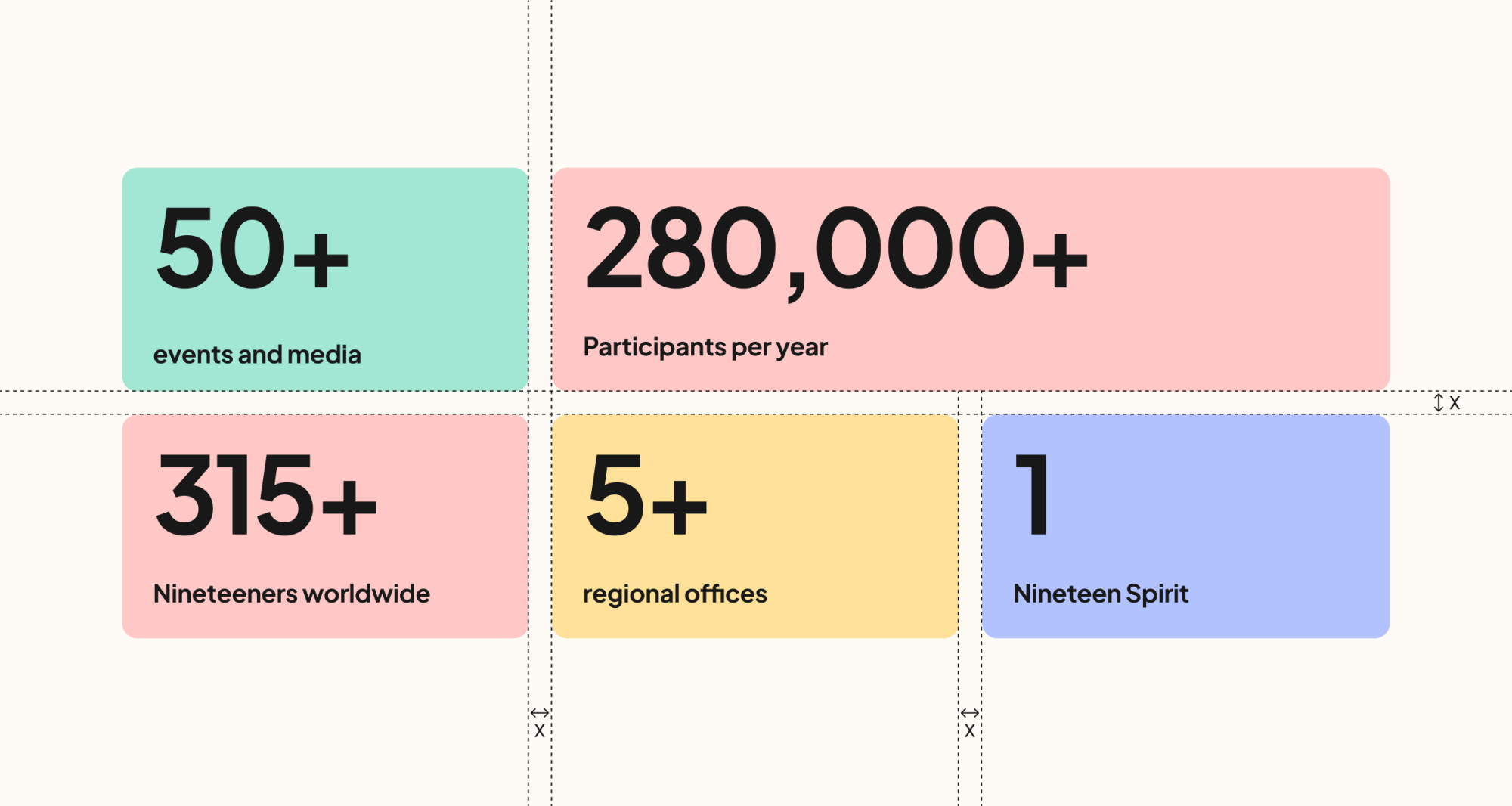
Containers can scale across multiple rows and vary in width depending on content needs. Regardless of layout, the spacing between containers should remain visually consistent — with both horizontal and vertical gaps using the same spacing value (X).