
Application examples
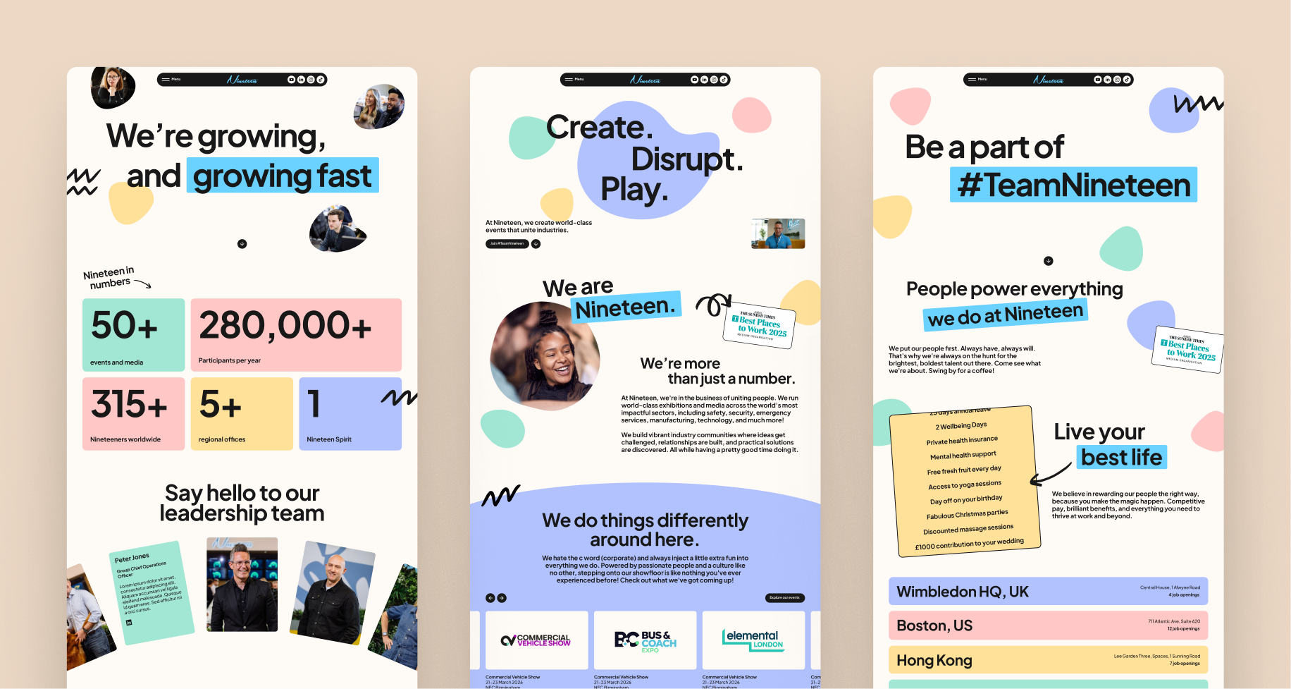
Website
An example of the brand system applied across the website. Orbs and scribbles bring personality, while structured containers help balance the composition and present information clearly.
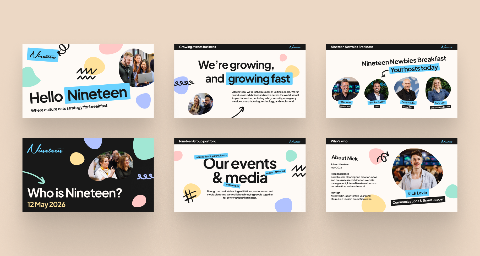
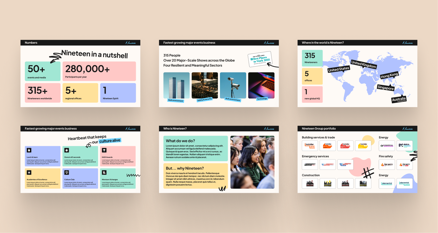
Presentation decks
Playful compositions using orbs, scribbles, bold typography, and organic placement work well for cover slides and high-impact moments, while structured containers and cards help organise information clearly when balance and readability are more important.
Social media
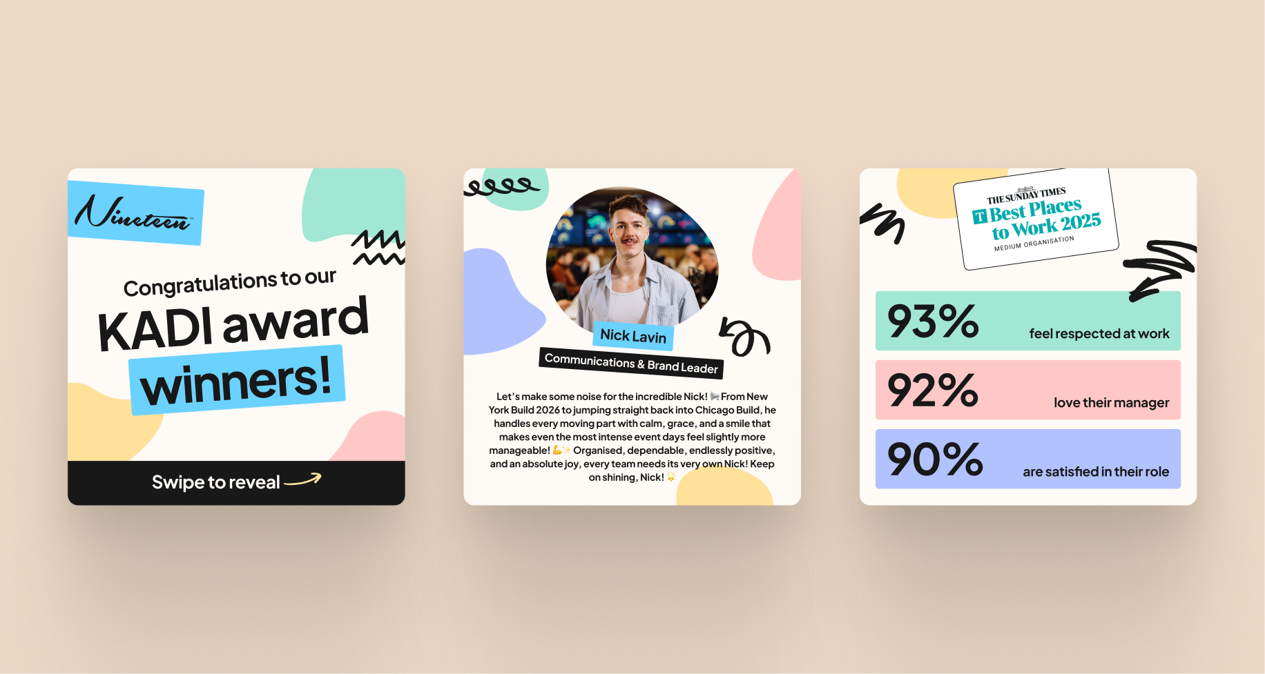
Example of the brand applied to social media posts — from showcasing KADI award winners using the orbs and scribbles, to structured statistic-based content using containers for clarity and consistency.
Portrait documents
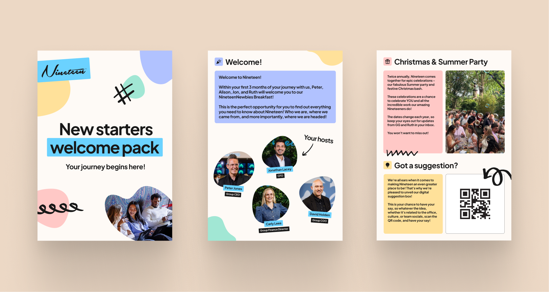
Example of the brand applied to an A4 portrait document format, suitable for materials such as new starter welcome packs. Decorative elements like the signature orbs and scribbles can be used on cover pages to create a welcoming and expressive feel, while containers help structure and balance information clearly across inner pages.
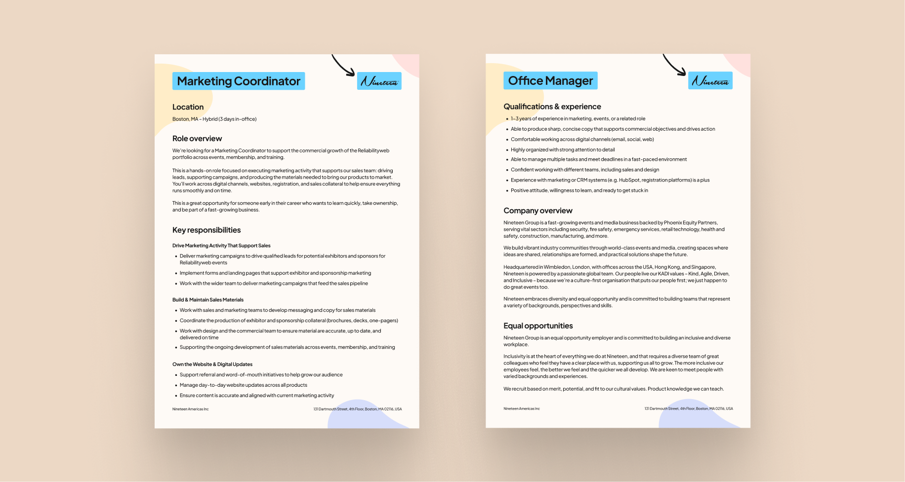
Letterhead
Example of the letterhead-style documents, suitable for materials such as job descriptions. Subtle low-opacity orbs can be used in the background to add personality while maintaining readability, paired with a bold blue highlight for document titles.
The examples shown use the background orbs at 40% opacity. As print output can vary depending on the printer and paper stock, a test print is recommended to confirm legibility and contrast.