
Colours
Overview
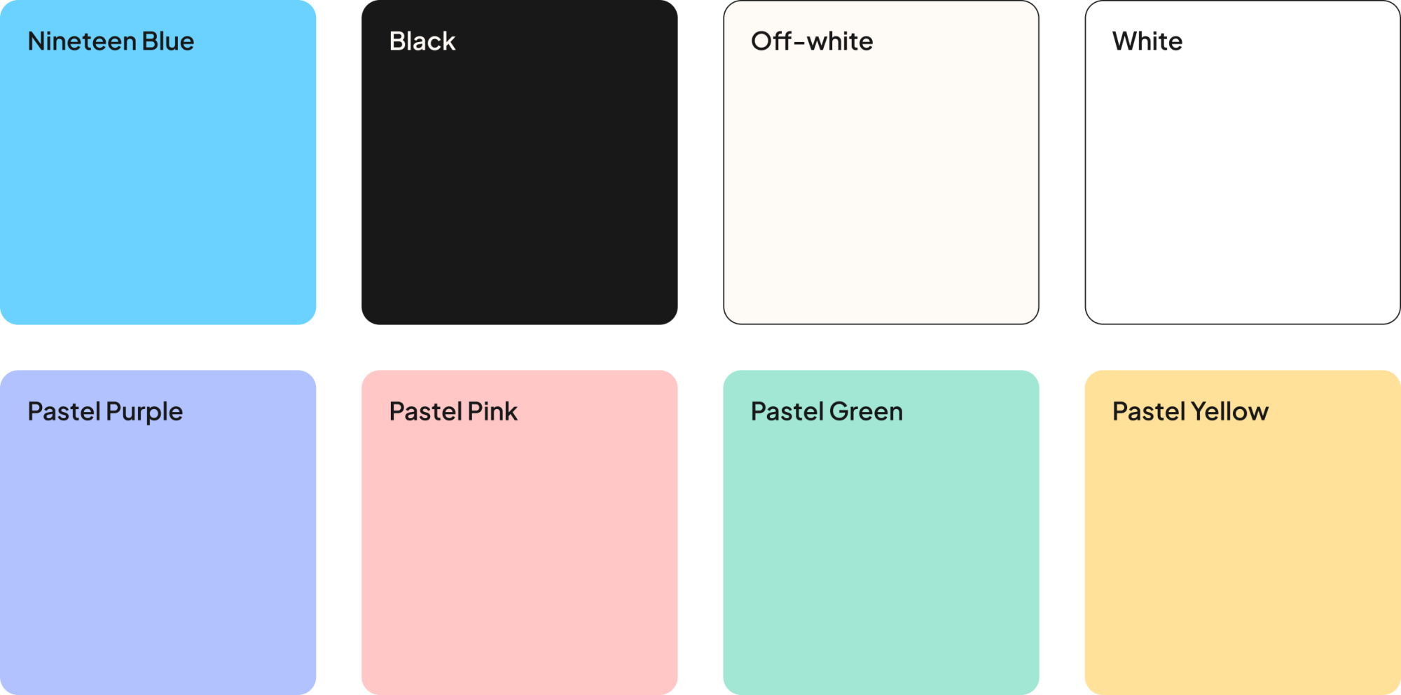
The colour palette consists of Nineteen Blue, black, off-white, white, and a selection of pastel colours.
Application Example
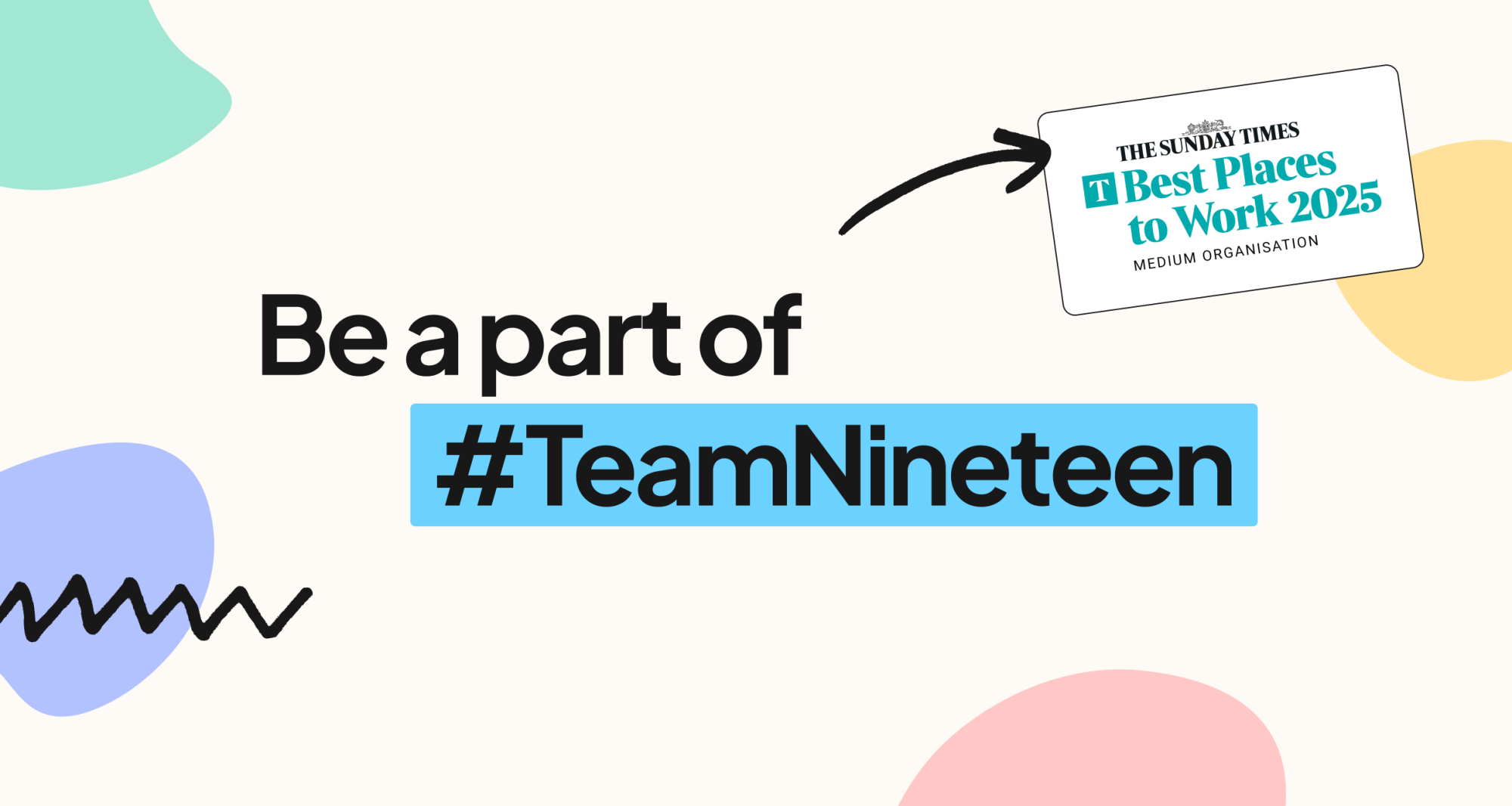
In most applications, off-white is used as the background colour. Nineteen Blue is used to highlight keywords within large text, while pastel colours act as supporting accents, such as the orb graphics. White should only be used when displaying third-party logos, such as events or awards.
Colour Codes
Colour values are provided in RGB and HEX for digital applications, and CMYK for print. Please note that printed colours may vary depending on factors such as printer calibration, paper stock, ink, and production method. For any printed materials, a test print is recommended to verify colour accuracy before final production.
- CMYK:
- 48 0 0 0
- RGB:
- 107 210 255
- Hex:
- #6bd2ff
- CMYK:
- 72 66 65 79
- RGB:
- 24 24 24
- Hex:
- #181818
- CMYK:
- 0 1 2 0
- RGB:
- 254 250 246
- Hex:
- #fefaf6
- CMYK:
- 0 0 0 0
- RGB:
- 255 255 255
- Hex:
- #ffffff
- CMYK:
- 27 19 0 0
- RGB:
- 177 194 255
- Hex:
- #b1c2ff
- CMYK:
- 34 0 22 0
- RGB:
- 161 231 212
- Hex:
- #a1e7d4
- CMYK:
- 0 26 13 0
- RGB:
- 255 200 198
- Hex:
- #ffc8c6
- CMYK:
- 0 11 46 0
- RGB:
- 255 225 154
- Hex:
- #ffe19a
Contrast requirements
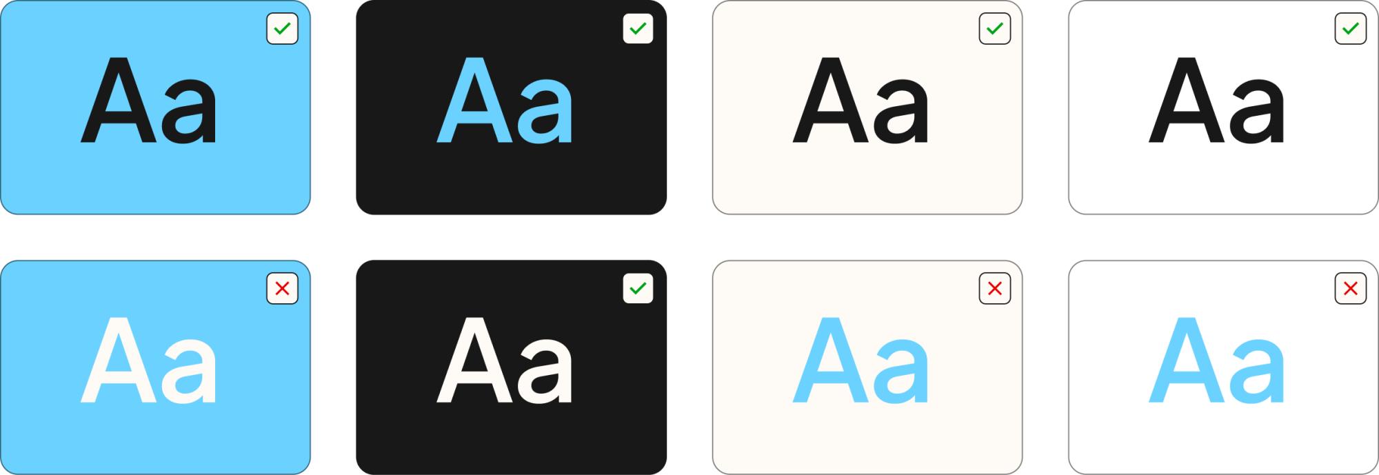
To meet accessibility requirements, only approved colour combinations should be used for text. Nineteen Blue and black can be used interchangeably as foreground and background colours, while Nineteen Blue and white should not be paired together, as they do not provide sufficient contrast for accessibility compliance.
Pastel contrast requirements
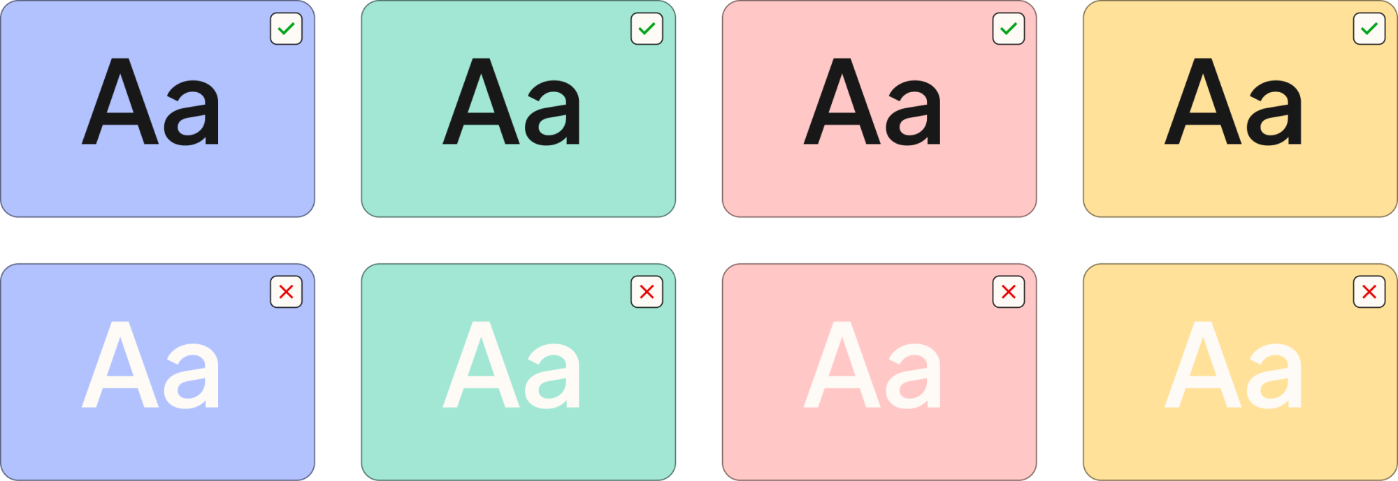
The pastel colour palette may be used as a background colour with black text. White should not be used on any of the pastel colours, as it does not provide sufficient contrast to meet accessibility requirements.